Metlife China
Role: Designer
Agency partner: R/GA
Creative direction: Brad Blondes
Design: Dylan Hughes, Shawn Dossantos
Design sprint, Branding, Digital Design
Adapting MetLife's brand system to more effectively resonate with the Chinese market.
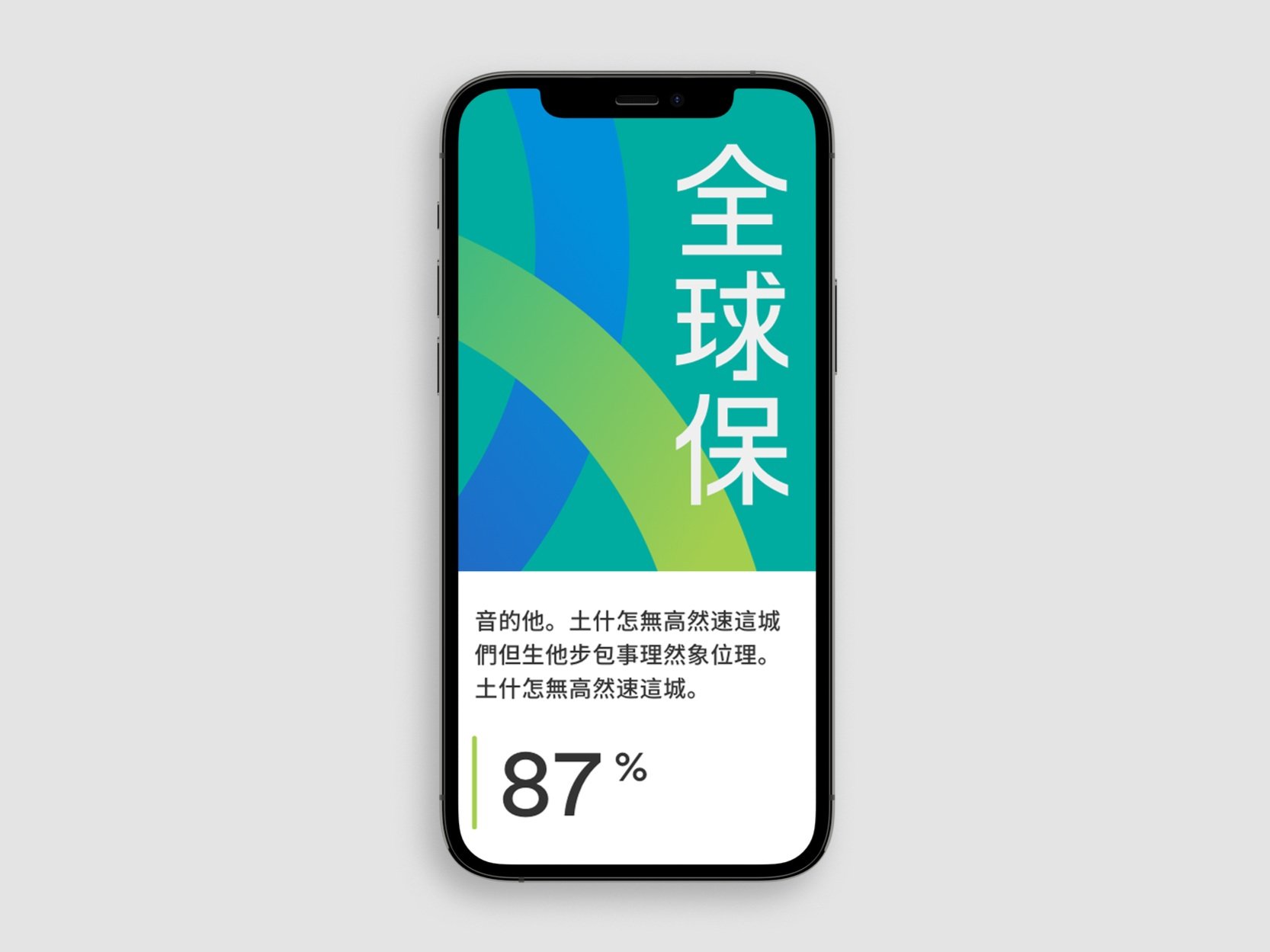
MetLife rebranded in 2016 and has since focused on localizing its global visual system across different regions. In 2020, we tailored the global system specifically for the Chinese market to build lasting brand relevance.
Just like our other sprints, we began by identifying core brand imperatives essential for China, then created design principles that effectively brought these imperatives to life. This approach guided the development of foundational design elements and product-specific assets uniquely suited to the market.
Both MetLife USA and MetLife China draw from core elements of the global visual system—such as a reliable color palette, bold graphics, and human-centered photography—while tailoring these features to better resonate with their specific audiences.
The MetLife brand in China embodies a modern and bold identity, while upholding values of reliability and trust. We drew from MetLife's existing secondary color palette, incorporating purple to convey luxury and nobility, while teal symbolizes growth and new beginnings. Our custom illustrations approach complex topics with a human and optimistic outlook. In line with MetLife’s photography style, we conducted custom photo shoots to emphasize genuine, heartfelt connections between people, capturing the essence of community and care that defines our core values.
In response to market request, we developed a straightforward illustration style that enables us to simplify and visualize complex topics and challenging subject matter. This approachable style helps where photography or text may fall short.
Explain difficult and complex subjects
These illustrations help us more clearly explain topics that are difficult to visualize; such as disease, death, and complex processes like experience design.
Showing our expertise
Our illustrations are purposeful and help us demonstrate our global expertise and commitment to our customers.
As with each localized sprint, guidelines were provided to better assist our local partners embrace this new brand extension, ensuring a more precise representation of the brand.


